(This is the second in a three-part of a series of articles explaining how color mixing works in handwoven cloth. If you read all three articles, you’ll understand the basic principles of how and why colors mix the way they do in weaving. No more muddy cloth!
If you want to dive deeper into design, I recommend my course Make Your Colors Sing the next time I offer it – it offers much more in-depth coverage of color mixing, hands-on exercises, and lots of information on visual design in handwoven cloth.) Registration for Make Your Colors Sing is closed; I am now teaching at Handweaving Academy.
In my previous color article, I talked about the first of the three fundamental principles of color mixing in handwoven fabrics – the draft and how it affects color in your finished cloth. In this article, I’m going to talk about the second principle – the scale of the visual patterning in the finished cloth.
Understanding why colors blend in handwoven cloth
Have you ever wondered why the same fabric, seen up close, can have bright colors, but seen from further away, can look dull and muddy? This variability can drive weavers utterly mad with its apparent capriciousness, but it’s actually quite predictable once you understand how and why it works. It’s the result of a phenomenon known as optical mixing.
Optical mixing works like this: The eye blends together dots of colors that are too small to make out as distinct patches of color, mixing them into a single color.
For example, in this series of enlargements, this printed version of a small section of a photo shows a smooth-looking twig in the lower left.
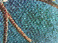
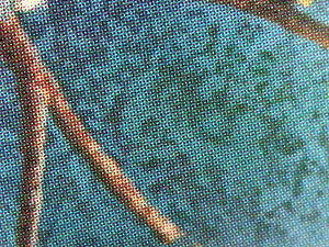
Blown up substantially, some grainy dots of color can be seen in the middle photo.
And placed under a microscope, many tiny dots of color are visible.
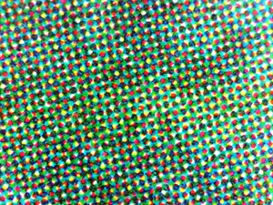
But the eye blends those dots of color into a single smooth color, because the dots of color are too small to resolve into individual patches of color.
Optical mixing in handweaving
If the dots of color are big enough to be barely distinguishable, the eye will still mix the colors together, but the result will be a spotty or heathered look. This partially optically mixed state is the most common way that colors interact with each other in handweaving.
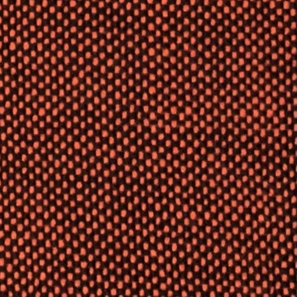
For example, in this swatch, orange and black yarns are woven together in plain weave. Plain weave produces the smallest possible dots of color, and the resulting cloth looks like a heathered brown. The optically mixed color falls midway between the orange and black of the two original yarns.
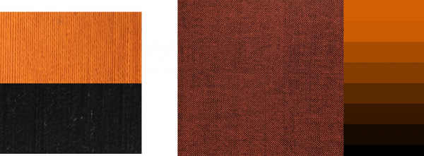
However, the scale of the patches of color matters. If the dots of color were bigger, they would be large enough that the eye could distinguish them clearly, and much of the optical mixing would be lost. You’d see clear dots of orange and black:
As a result, the size of the pattern components – the scale of the pattern – matters a great deal when determining whether colors will mix in weaving.
This means that, when the question arises of whether a draft will really blend colors, the answer is often “it depends”. The thickness of the yarns and your viewing distance from the finished piece will make a huge difference in the scale of the draft pattern and thus in how much the colors blend. Large scale patterns blend colors together less, while small scale patterns blend colors together more.
Put another way, if you weave any draft in very fine yarns and stand fifteen feet away, you’re much more likely to find the colors blurring together than if you weave the same draft in thick yarns and stand three feet away. That’s because a draft woven in fine yarns and seen from far away will naturally be seen at a smaller scale.
The factors that affect pattern scale are yarn size, the number of threads in each design unit of the drawdown, and the viewing distance. We’ll talk about each of these in turn.
Yarn size
Thick yarns blend colors less than thin yarns.
Thicker yarns create a larger scale pattern, with less color blending, than thinner yarns, something that is especially important to keep in mind when weaving with rigid heddle looms, which tend to use thicker yarns than table or floor looms.
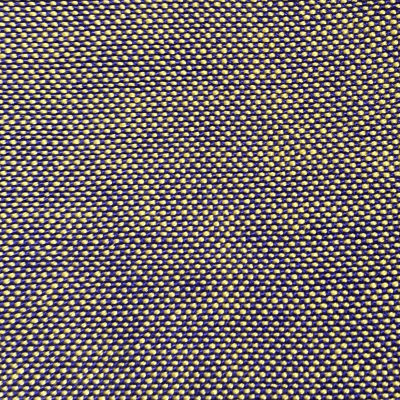
These two swatches are woven in the same colors, yellow and purple, but one is woven in a fine yarn (20/2 cotton) and the other is woven in thick, worsted-weight wool yarns. The dots of color are much smaller in the 20/2 cotton yarn. This produces a smaller-scale pattern, allowing much more optical mixing, so the colors blend together quite a bit. In the swatch woven with thicker yarns, you get larger dots of color, and thus a larger-scale pattern, with less optical mixing/blending between colors.
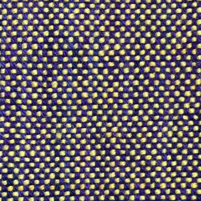
Swatch in worsted weight wool yarn
In a slightly less extreme example, these two huck lace swatches are woven in the same colors, one using a yarn twice the weight of the other. The one using the thinner yarn shows more color blending than the thicker yarn.

So in the same draft and same colors, a thicker yarn will blend colors less than a thin yarn.
Number of threads per design unit
The more threads in each design unit of the draft – the bigger and less delicate the pattern – the larger each patch of color becomes and the less likely it is to blend into its neighbor. I call this the “sturdiness” of the draft.
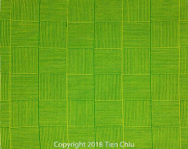
Here is a sturdy draft:
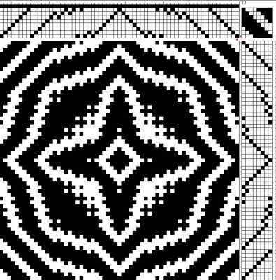
Each of the areas of pattern is composed of black or white (representing areas of solid warp or solid weft) and the lines are thick, with many threads in each.
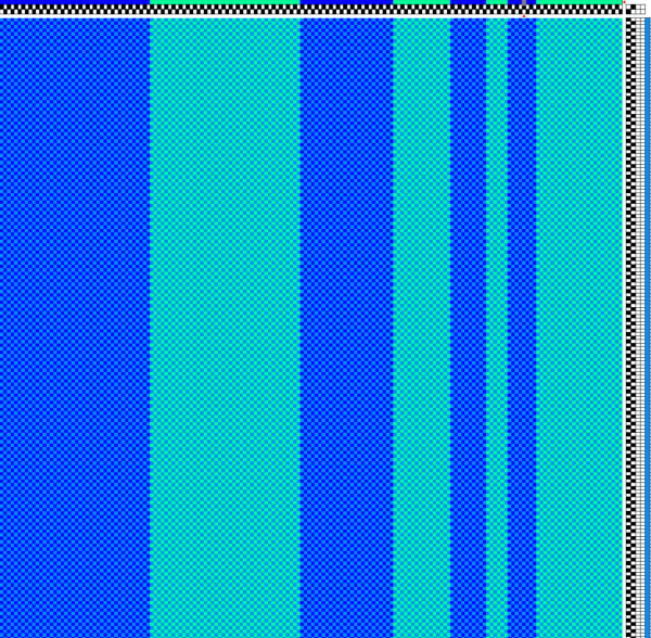
The patches of color need not be created by the draft structure. Here is a cloth with a sturdy pattern even though the structure is plain weave – the sturdiness is created by the color striping, which has many threads in each stripe.
This log cabin swatch, on the other hand, is woven in a delicate pattern – composed entirely of thin stripes of color – and shows much more color mixing.
Finally, there’s viewing distance.
Viewing Distance
The final factor in optical mixing is the distance from which the finished object will be seen. Viewing distance makes a big difference to the degree of optical mixing, because objects seen from far away appear smaller – and so do their patterns. This means that objects seen at a distance will have their colors blur together more than objects seen close up.
These tiny lavender sachets are woven from rayon machine embroidery thread, about 12,000 yards per pound, in a huck lace pattern.
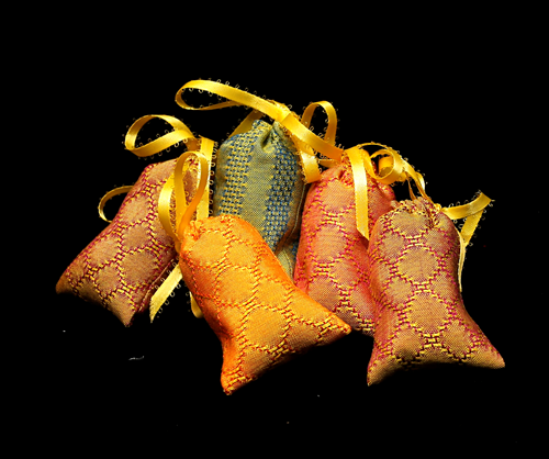
This is a plain weave based pattern. They are designed to be viewed close up, so that the subtle huck lace pattern is visible. But even at a distance of two or three feet, the yarns are so fine that the plain weave areas appear to be a nearly solid color due to the optical mixing. Only by moving up to a few inches away can you make out the individual threads, eliminating the optical mixing and enabling you to see the pattern in the plain weave.
If you were to look at these sachets from across the room, they’d likely appear to be a nearly solid color, since the huck lace pattern is quite subtle.
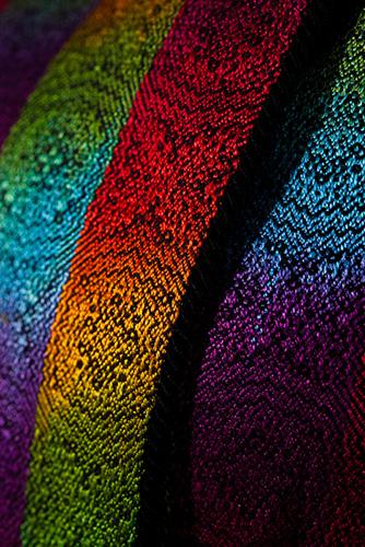
Optical mixing is especially important to keep in mind when designing large exhibition pieces or garments for fashion shows. If you look at my Kodachrome Jacket from a foot away, you can appreciate the beautiful advancing twill pattern woven into the cloth. But from ten feet away, that pattern disappears, and all you see is patches of solid color.
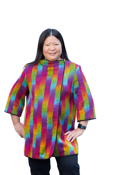
This is one of the reasons that handwoven garments need to be carefully planned to do well on the fashion runway. Garments on a runway are typically seen at a distance of ten to thirty feet – or even further away. From that distance, all you can see is shape, the cut of the garment, and the color. Most draft patterns are simply too fine to be visible; unless they are really bold, optical mixing blends them into a single color. So warp and weft stripe colors, or painted warps, should be considered as design elements.
At the same time, the garment will also be displayed in a gallery and judged up close. So to create handwoven garments that do well on the runway, you have to think about how they will show at multiple distances, and design them to offer something to the viewer both close up and far away.
To consider the effects of scale, it’s important to view your samples – whether created through sketches, weaving software simulations, or physically woven samples – at the scale that the final piece will be viewed. This may mean walking six feet away from your computer monitor to view your scarf draft, putting your place mat sample on the table and then sitting down in front of it, or some other creative method of simulating your piece at the correct scale. But if you want to know how the colors will mix, it’s absolutely critical to get the scale right.
Summary
The second pillar of understanding color mixing is the scale of the patterning in the finished cloth, because the pattern scale determines how much the eye visually blends colors.
- Small dots of color blend together in a process known as optical mixing. Larger patches stay distinct.
- Thus, larger scale patterns tend to be more visible than smaller scale patterns, which tend to blur together into a single color, especially at a distance.
The three factors affecting pattern scale are:
- yarn thickness – thicker yarns produce larger scale drafts and thus blend less
- the number of threads in each pattern component – the more threads, the larger the scale and the less color mixing in the pattern
- the viewing distance from the finished piece – the closer the viewer, the bigger the scale and the less color mixing.
In my next article, I’ll discuss the final pillar of color mixing, the actual colors involved.
Happy weaving!

Oh, my gosh, Tien. This little 3-part series is so helpful. It makes so much sense. Thank you for your clear writing, your illustrations and examples, and for your heart full of generosity.
So glad to hear that, Gayle! 🙂
Thank you so much for sharing this series! I've learned A LOT since catching up with you, first through your blog, then on Facebook. Still drafting rather than weaving (the looms keep waiting..) and so far resisting buying an AVL compudobby (I should live so long..) Thanks for keeping me in the loop. I think applying these 2 color discussions will be very timely for where I am at in Shadow Weave.
Glad to hear that they will be useful! I have just given in to the Dark Side and am about to switch out my Baby Wolf for an AVL Workshop Dobby Loom (again – history repeats itself…) 🙂
Thank you for reaching out across the weaving ether to encourage 'the little grey cells' to spark afresh.
I now live in a 'shoe box' of a Retirement Villa and I look after 3 elderly people with little time to myself. BUT, I still brought my loom with me and I can still dream and plot weaving in the wee hours of the morning. So, for me at least, weaving is a life saver, whether I am able to throw a few picks or not!
I will look forward to the third installment and devour it with relish ( or lemon curd which ever comes first!).
Hurray for weaving! Enjoy your “stolen moments” and I hope you get plenty of weaving time soon!