If you want to create gorgeous handwoven projects, using the right tools to select and design your piece will make your life a lot easier. Here are seven excellent color tools for handweavers.
1. The Black and White Photo
When I start picking out yarns for a handwoven project, the first thing I do is snap a photo of them in black and white. That’s because whether or not your pattern shows depends almost entirely on the amount of light/dark contrast in the pattern, and if there isn’t enough light/dark contrast between your warp and weft yarns, your woven pattern won’t show clearly. (Of course, sometimes you want a subtle pattern, in which case this is exactly what you want!) So I always check to see how much contrast in darkness there is between warp and weft yarns when picking a palette.
But it can be hard to tell the darkness of a color just by looking at it, since saturated (bright) colors and warm colors look lighter than they actually are. But if you snap a black-and-white photo of the yarns with a smartphone or digital camera, you can get a true idea of how much light/dark contrast there is between the two yarns.
You can see how this works in these two photos. On the right, the orange skein looks lighter than the purple and blue skeins, because it’s a very saturated and very warm color. But a black and white photo shows the truth: They’re all the same darkness. A pattern woven with these three yarns won’t show clearly.


Smartphones and digital cameras often have many different black and white filters, though. The best filter to use on the iPhone is the Mono filter; on Android phones, the BlackCam app (free) with the Classic filter will do the job nicely.
(Want to know more about how to make your pattern show clearly? Sign up for my newsletter and get my free PDF Color Secrets: Three Keys to Making Crisp, Clear Designs.)
2. The Yarn Twist
After I’ve taken a black and white photo, if I have the yarns in hand, I’ll often do a yarn twist. This is a super-quick test to see how much the yarn colors will blend when woven together. Sometimes I want them to blend and sometimes I don’t; this is a very quick and easy way to find out. Simply take the two yarns and twist them together. If you get a barber-pole look, they will tend to produce a checkerboard or heathered look, and the pattern will show clearly; if they look like a single color, they will blend smoothly and the pattern will be subtle.
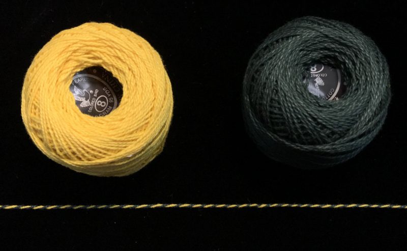
In the first photo below, the yarns blend when twisted together, so they will blend when woven. A pattern woven with these yarns will be subtle and tend to disappear.
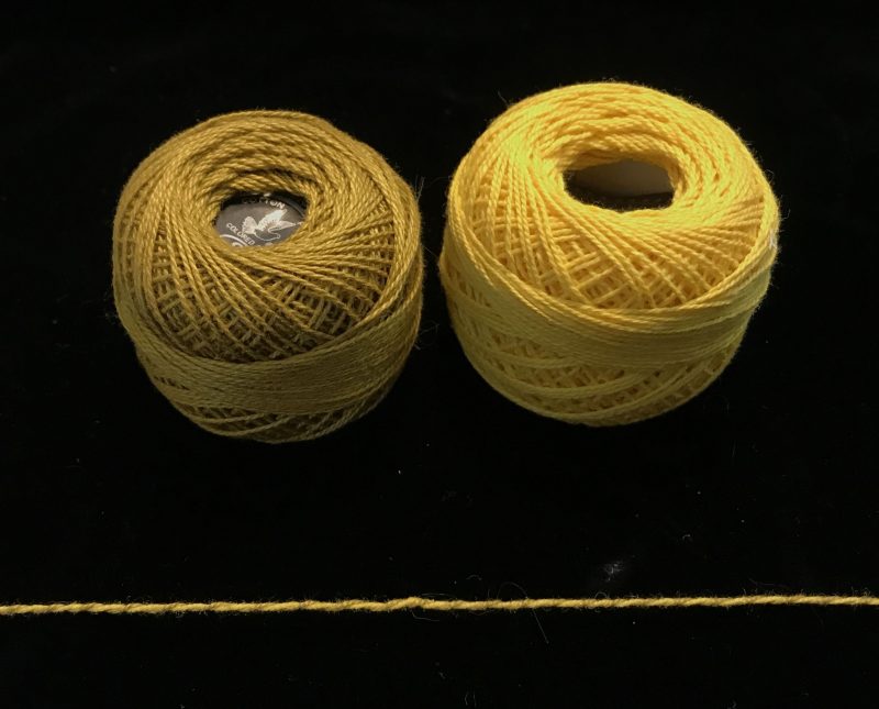
The yarns in the photo below, on the other hand, stand out clearly when twisted together. They will produce a checkered or heathered effect when woven together in plain weave, and a woven pattern will show clearly (if it is big enough to see).
3. The Warp & Weave Color Mixer Tool
Once I’ve figured out whether two colors will make my pattern show, I want to know what they’ll look like when they’re woven together. This can be tricky, especially since weave structure plays a huge part in how much color mixing there is and in what proportions the colors will mix. (More about the role of weave structure in color mixing in this blog post.)
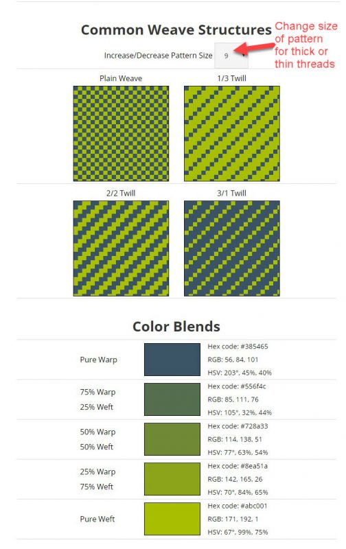
To make this easier, I’ve created a free online tool, the Warp & Weave Color Mixer (sorry – this tool is no longer available), that shows how your warp and weft yarns will mix in four common weave structures and in a variety of yarn sizes. The weave structures don’t have to be taken literally; even if you aren’t using a 3/1 twill, for example, the 3/1 twill display will give you a rough idea of what your cloth will look like if you’re using a draft that blends warp and weft in a mix that shows about 3 parts warp, 1 part weft on top. It’s even helpful if you just want an idea of what a warp-dominant blend will look like.
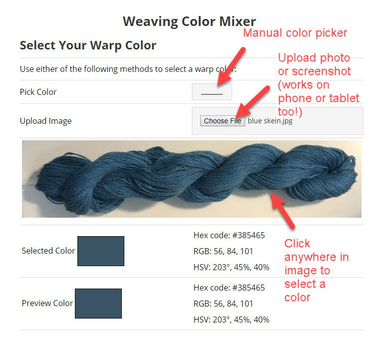
To use the Warp & Weave Color Mixer Tool, simply upload photos of the yarns, click on the photo to select a color (you can also select or change the colors using a manual color picker), and it instantly shows how the colors will mix in plain weave, 1/3, 2/2, and 3/1 twill. You can change the yarn size using a dropdown, to simulate fine yarns or thick ones.
The tool also shows you blends of the colors in various proportions, and gives you the numerical RGB, HSV, and hex codes for each blend. This can be handy for entering into your weaving software.
Here are two screenshots showing how the Color Mixer Tool works:
Here’s the Warp & Weave Color Mixer Tool, and detailed instructions and a video for how to use the tool can be found here. This should definitely become part of your color toolkit!
4. The Sketch (Digital or Physical)
If I’m making a project that’s more complicated than a simple draft, I’ll sketch out my project in advance. I’m most comfortable sketching things out on the computer using Photoshop, but other people use colored pencils on paper, or different media or software. The medium doesn’t matter – anything that works (including sketching it out in your head!) is fine.
The purpose of the sketch is simply to rough out the idea for the piece. It might be as simple as a few scribbles, and it might be very crude (mine always look like a six-year-old drew them). As long as it helps you think through the idea, it’s all good.

5. Weaving Software
Once I’ve sketched out my design, if it’s a complex one, I’ll often render it in weaving software so I can get a better idea of what it will look like. Weaving software comes in different types. Not all of them are expensive – some are freeware or donationware, others are inexpensive or have free trial versions where print and save are disabled but otherwise are fully functional. I personally use iWeaveIt on my iPad and iPhone, Weavepoint and Fiberworks PCW on my desktop, and can recommend all three (Fiberworks is my favorite for design) – but there is a long list of alternatives on Judie Eatough’s website, which provides a comprehensive list of weaving software.
The big advantage of weaving software is that it allows you to see what your entire piece will look like, including colors and draft, at any scale you like. This is hard to do any other way! So for complex pieces, it is an extremely valuable and worthwhile investment.
6. Woven Samples
Woven samples are often recommended as a tool for design. But they are very expensive to make, so they are the very LAST step in my design process. I only weave samples as a last resort – when all the other design questions have been answered and there is no way to test my design other than to create a sample of the actual cloth. I weave samples when I need to know about things like the sett of the fabric or how the physical fabric will look once it’s woven and wet-finished. Computer simulations will tell me what the design will look like, roughly speaking, but colors on a monitor are often inaccurate, so I need a sample of physical cloth to know for sure what the piece will look like. So a woven sample, while expensive, has its place.
Because I am usually testing the sett at the same time, and sett is best tested at the full width of the fabric, I will typically weave the sample on the same warp that I plan to use for the finished fabric. At this point I am generally committed to the warp colors and am simply testing weft colors and the draft (I can rethread if needed). I always add an extra half-yard onto the warp so I can weave a sample and wet-finish it before weaving the whole project.
7. Color Knowledge
My final tool for creating with color is simply knowledge about color. While these tools can help you with your design process, a solid understanding of color and how color works will drastically improve your results. I urge you to study color however you can. I offer many options here on my website – through my blog posts, my free Color Secrets book, and my online color classes. My Color & Design class, in particular, will move you from color novice to color ninja – the best color tool of all. Note: Registration is closed for all my courses; I am now teaching at Handweaving Academy.
Happy weaving!

If you want to know more about how to create crisp, clear designs in your handwoven cloth, subscribe to my newsletter and get my FREE e-book! It will help you design beautiful handwoven fabrics, with a pattern as bold or subtle as you want.
Thank you for this – it has certainly helped by applying the camera filters that I didn’t know were there. So, hopefully, my colour choices will be even better.
This was very helpful! Thanks!
I also use iWeaveIt on my iPad. Still getting use to the program. I don’t have a program for my iMac yet. I f in it frustrating when a pattern repeAts and there isn’t anyway to program that in other than manually. I’ve heard that weaving software for iMac can do that. I have saved this blog for reference. A lot of VERY HELPFUL information.
Your tool to plug in colors , is there a site to download it?
Hi Sheryl – No, it’s strictly browser-based, at least for now!
Under the sea – bellissimo, bellissimo, bellissimo !!!
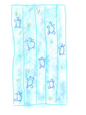
I’m curious if you would share the turtle pattern. I love turtles and would like to try this.
I’d be happy to email it to you if you like, but be warned – it’s a 40-shaft draft!
Terrific input. Great for "color challenged" like myself.