Picking colors that look good together is one of the biggest challenges of color in weaving. It can seem daunting: How do you select a palette that goes together, yet doesn’t mix into mud?
Here are some suggestions.
There are many right answers
First, there is no one right answer to “colors that look good together”. If you ask three weavers whether a given color palette looks good, you’ll likely get three answers – or eight, if you’re asking on different days!
“Looks good” also depends on your intent for the project. A dramatic runway garment would call for a different color palette than a conservative suit for a job interview! But there are ways to tweak a palette to increase or decrease harmony when working with color in weaving, and those methods don’t change.
Color is a conversation
Think of color palettes as a cocktail-party conversation: The bigger the difference between the colors, the livelier the conversation. Of course, a too-lively conversation may turn into a heated argument! That might be appropriate in some contexts…and not in others.
Colors can contrast in hue, value, or saturation – the three aspects of a color. When people talk about how well two colors harmonize, they’re usually talking about the hue – the color family (like red, green, or blue), amplified by saturation.
Hue
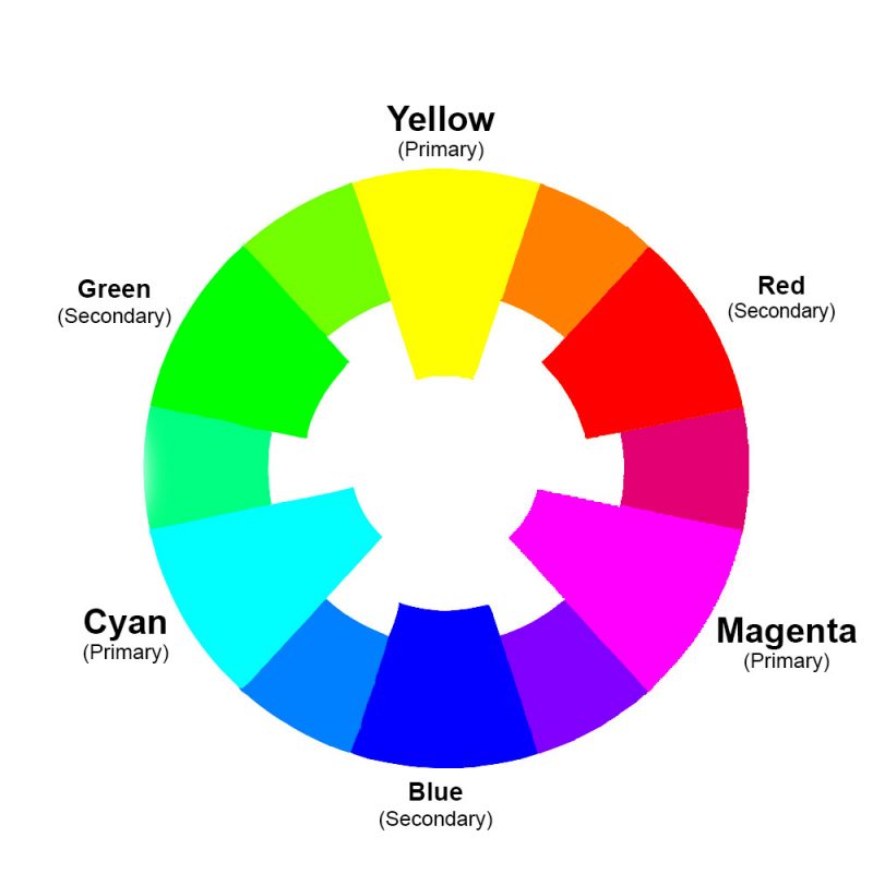
Colors that are located close together on the color wheel harmonize. Think of them as having similar political opinions. On the other hand, colors that are opposite each other on the color wheel may easily clash, just as people from opposing sides may square off at a debate.
A piece that consists entirely of colors that are of similar hue – colors packed close together on the color wheel – will harmonize, but might feel somewhat boring, just as a cocktail party where everyone agrees on everything might need a bit more pizzazz. Often, adding a dash of color from the other side of the color wheel adds just that bit of spice needed to liven up the party.
Here’s a color wheel that shows the pure hues:
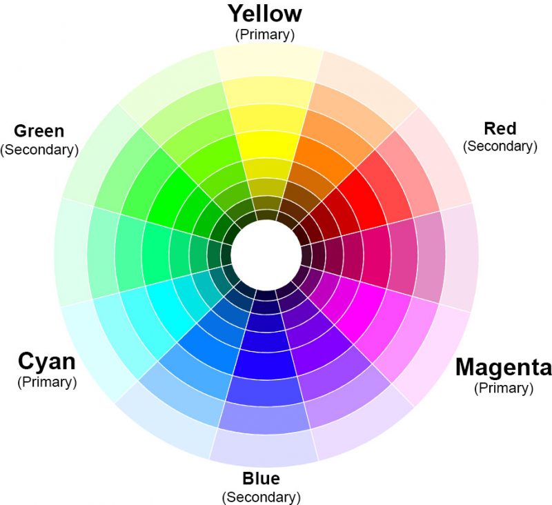
And here’s a color wheel that shows the hues with their shades and tints (lighter/darker versions), which may help you identify colors that aren’t pure hues.
Choosing colors that are close together on the color wheel will give a sense of harmony, while choosing colors that are far apart on the color wheel will give a sense of excitement and “color controversy”. What’s clashing and what’s harmonious? That’s up to you and your tastes in color.
But if you want more excitement in your palette, add a color from further away on the color wheel; if you want a more harmonious feel, move the colors closer to each other on the color wheel.
(Note: There are two color wheels in common use, the Cyan-Magenta-Yellow and the Red-Yellow-Blue color wheel. I use the Cyan-Magenta-Yellow color wheel because it’s more accurate for color mixing. Traditional color harmonies use the Red-Yellow-Blue color wheel. In my opinion, what’s important is the amount of contrast between colors and not their precise location on a color wheel. Thinking in terms of contrast rather than combinations of color wheel positions gives you more flexibility. So that’s what I teach. But if you prefer the Red-Yellow-Blue color wheel and traditional color harmonies, use them!)
Saturation
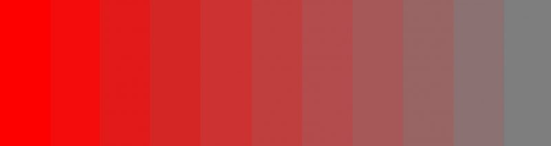
Saturation is the intensity of a color – how much gray is in it, relative to the pure hue. In other words, saturation is whether it is bright or dull. (Think “cherry red” vs. “brick,” or “grass green” vs. “pine”.)
Here’s an image that shows the progression of a hue from fully saturated (bright red) to completely unsaturated (neutral gray):
(More about saturation in this article.)
The easy way to work with saturation is to think of it as “strength of opinion” in the cocktail party conversation. Highly saturated colors, like bright orange or brilliant purple – are opinionated, like a passionate activist. They’ll engage strongly in a color “conversation”.
Less saturated colors, like browns, olive greens, dull blues, pastels, etc. – plus the neutral colors (grays, black, white) – are less opinionated. They’ll let the more saturated colors do most of the talking. (This isn’t a bad thing – the last thing you need at a cocktail party is eighteen divas shouting over each other!)
When choosing colors for contrast, keep in mind that the more saturated the color, the more “heatedly” it will engage in conversation. So if you are using two very saturated colors that are also color-wheel opposites, keep in mind that it will make for lively conversation indeed!
Proportion
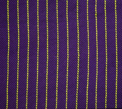
The proportion of colors also makes a difference to the color harmony (or lack thereof). Two colors that argue loudly can be made harmonious if one color dominates. (Usually it’s better if there is less of the “louder” color.) For example, in these two swatches, the purple and lime green are far apart on the color wheel. When there are equal amounts, the colors argue loudly. But when there is far more purple than lime green, they harmonize.
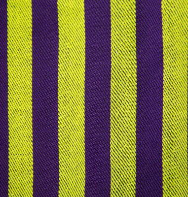
In the conversation metaphor, this is like one person shutting up and letting the other person do most of the talking. It may not be satisfying for the person who is quietly fuming at the holiday gathering, but it makes for much more peaceful conversation!
Keeping far-flung colors separated
Color in weaving isn’t just a question of choosing yarn colors. Weaving is like painting. Your yarn colors are like tubes of paint, giving you some base colors to work with. But your draft acts as the palette and paintbrush. It mixes the colors and uses them to create a design on the “canvas” of your handwoven cloth.
When colors are far apart on the color wheel, they tend to mix into dull colors. (More details on that in this article.) If you want to avoid this, using stripes in the warp or weft, and/or a draft that separates warp and weft colors, is critical.
In the purple and lime green swatches above, the purple and lime green are from opposite sides of the color wheel. If they were woven together as warp and weft in plain weave, they would weave into a dull color. But by using them as warp stripes, rather than interlacing them as warp and weft, the colors are kept separate from each other and stay bright.
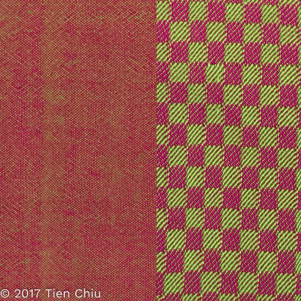
In these two swatches, the same warp and weft produce a dull brick red or a bright magenta/green checkerboard depending entirely on the draft. One (plain weave) blends a magenta and green weft together to produce dull brown. The other places large warp-dominant areas next to large weft-dominant areas to produce a bright magenta-and-green checkerboard. Same warp and weft, different interlacement!
So in addition to thinking about your yarn colors, you also need to think about how your draft mixes your yarn colors together, and how it places those mixes into the cloth.
So that’s it! I hope this article has given you some insight into picking color palettes that harmonize nicely in handwoven fabrics, and keeping them bright through careful placement in the cloth.
Happy weaving,

If you want to know more about how to create crisp, clear designs in your handwoven cloth, subscribe to my newsletter and get my FREE e-book! It will help you design beautiful handwoven fabrics, with a pattern as bold or subtle as you want.
I do a lot of Inkle Weaving and teach others to enjoy Inkle Weaving. When choosing colors for an Inkle band, I have students make use of the ability to change any photograph on their iPhones to gray-scale. If the colors will work well together, they can see them as different gray tones. However, I am always amazed at how many colors that seem so different to the eye, become the same gray tone. as for myself, when I have a series of colors of different gray tones, then I decide how to put them together for weaving. This is a very quick way to sort colors. And, over time, students come to learn what colors will and will not work together without even using the gray scale conversion of photographs.
This is the best color help article i ever read and ive looked for years. I make jewelry and color opinion mess me up. Probably from always having too much to chose from and only buying what i like (same as i do with clothes), by the piece and not the bigger picture. I have read many articles and the color wheel on here scared me a little. Lol. Im use to The headline: " Best color pick method…
This is the color wheel…so you have analogous, complementary"….this is the part of art class i made sure i cut ever year because, frankly,.big words use to scare me. Lol. I get it but it's not right. Maybe just out dated. Im not sure where neutral tones, blacks or whites really mix until today. Im 40 btw so its over due but that conversation analogy hit it in for me. Im excited. Thank u. What Crappy art teachers i had. Yikes.
I’m glad to hear this was helpful for you!