Have you ever struggled to create handwoven fabric with the look and feel that you wanted? No more. This article, a selection from my online course Color & Design, will help you create the right mood in your handwoven fabric.
The ambience of a fabric – the emotions evoked by its dominant colors – is one of the three big contributors to the look and feel of a handwoven project. (The other two are drama and visual intrigue.) Ambience is created by your color palette, and the strongest influence on the ambience is how light or dark your colors are. That’s because the darkness of your dominant colors sets your sense of the surrounding lighting.
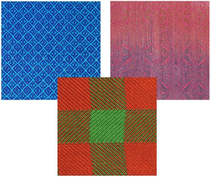
Dark colors make us feel as if we were in a dark place, and give us weighty feelings: somber, mysterious, stately, depressed. These three swatches are all woven using different drafts and different colors, but they all give us a sense of darkness, with a somber, weighty mood.

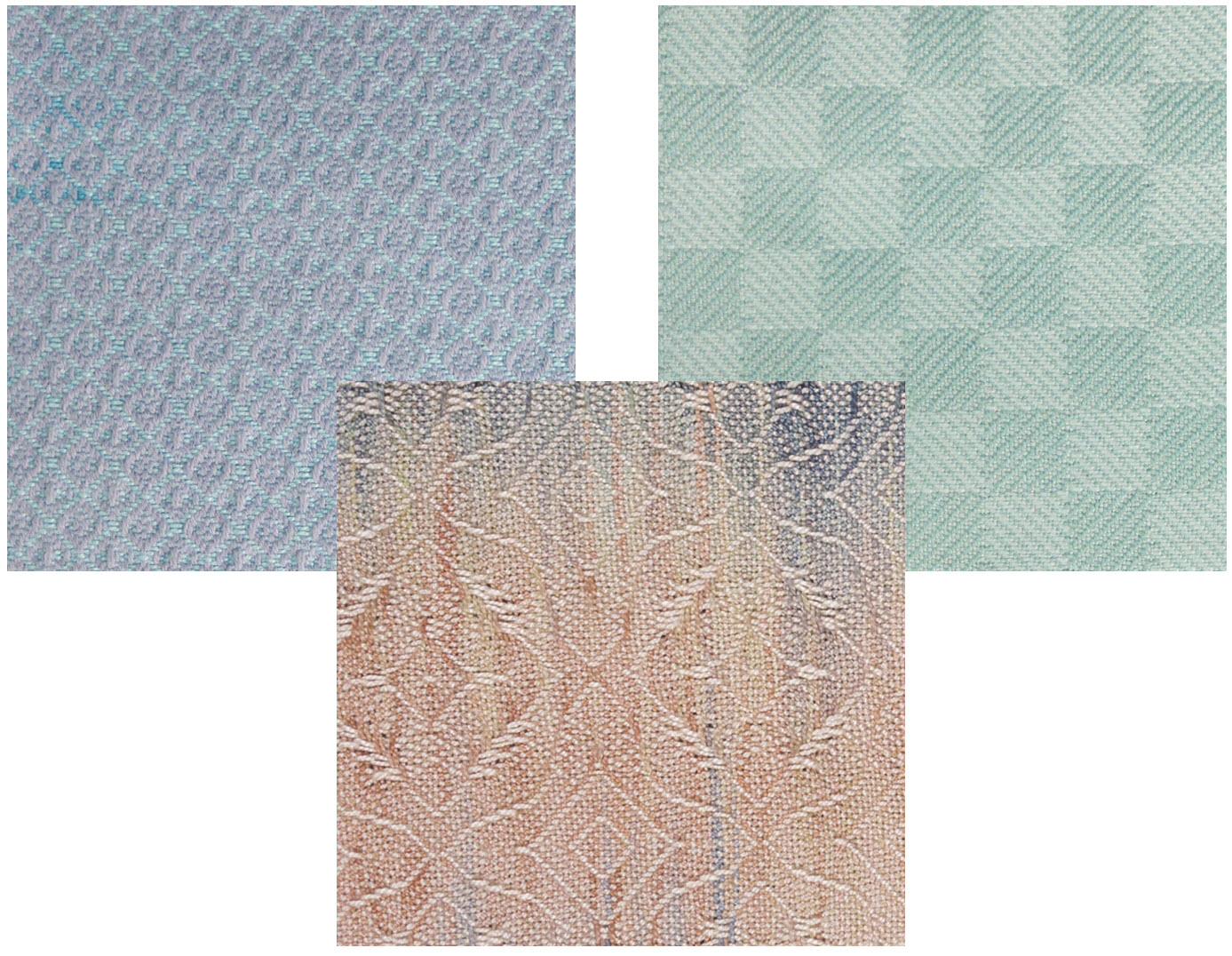
Light colors, conversely, make us feel as if we were drenched in light. We associate them with dreamy states, with spirituality, with purity – or, more mundanely, with places that are brightly lit: the beach, the sky, the noon sun. The three swatches below all feature different drafts and different colors, but all have an airy, dreamy feel.
Colors that fall in between, neither light nor dark, tend to feel more everyday, because they make us feel like we’re in moderate lighting, i.e. the lighting we see most of the time we’re awake. So they cover a broad range of emotions, but they tend to feel more “normal,” neither somber nor surreal. These three swatches are all of medium darkness, and they all feel quite different, but they all have a matter-of-fact feel to them that differs from the very light and very dark swatches.
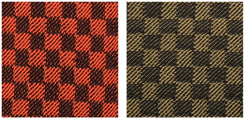
The saturation of a color – whether it is bright, like cherry red, or dull, like maroon – also has a profound effect on the mood of a fabric. A more saturated fabric is more visually assertive and feels more lively. The two swatches here are woven using the same draft, but one is woven using bright orange and the other a dull olive. The orange swatch feels much more energetic and lively than the less saturated olive swatch.
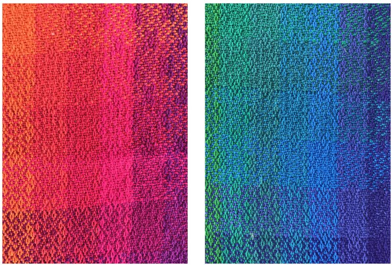
The hue, or color family, of a color also affects the ambience of your fabric. A piece that is in warm colors – yellow-greens, yellows, oranges, and some reds – will feel warm, engaging, and possibly even aggressive! A piece in cool hues – some greens, blue-greens, blues, purples, and purple-reds – will feel cooler, calmer, or receding.
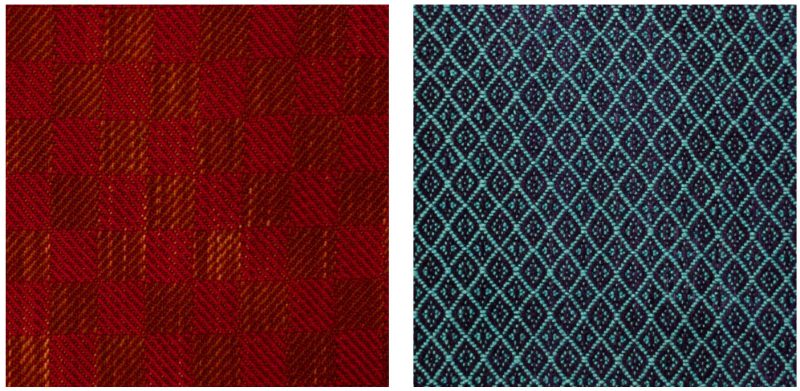
The saturation of a hue amplifies its personality. Warm colors become more aggressive when they are more saturated, cool colors become more reserved. If you compare the two swatches below with the two swatches above, you’ll see that the dull red swatch on the left still feels warm and inviting, but not as aggressively warm as the more saturated one above this paragraph. The black and turquoise swatch on the right, while cool, is not as strongly reserved as the more brilliant blue swatch above it.
To sum up:
- If you want to create a fabric with a serious mood, using dark colors will help. Dark colors give us the impression of dark lighting, creating a weighty, serious feel.
- If you want to create a handwoven project with a light, dreamy, or spiritual feel, using light or pastel colors will help. Light colors give us the sensation of being in brightly light places, which we often associate with spirituality or dreaminess.
- If you want a piece that buzzes with energy, use saturated (bright) colors.
- If you want a piece that feels quietly elegant, use dull, understated colors.
- If you want a piece that warmly engages the viewer, using warm hues – yellow-greens, yellows, oranges, and orange-reds – will help. The more saturated (brighter) the colors are, the stronger their “personality” will become.
- If you want a piece that cools and calms, or which recedes quietly, using cool hues – blues, purples, red-purples, and some greens – will help. The more saturated (brighter) the colors are, the stronger the effect will be.