It’s happened to all of us. You buy a box of yarn sight unseen on Facebook or eBay, or pick up a “bargain” at an estate sale, or maybe you just stumble across a cone of yarn you bought eight years ago and wonder, “What WAS I thinking??? I can’t stand that color – how am I ever going to use it??”
Well, before you regift that yarn, stuff a pillow with it, or throw it away, here are a few ideas for how to use (and love!) it in your weaving!
Strategies for weaving with a color you can’t stand
There are basically two ways to use a color you don’t like. The first is to make it less conspicuous in the design, and the second is to change it into something else by mixing it with a different color or colors. I’ll cover how to make the color less conspicuous in this post.
(Mixing colors you don’t like to create a new color (that you do like) depends on what color you’re mixing and what draft you choose. That’s a more complicated process than will fit in a single post, but to learn all about color mixing, you can check out this series of blog posts – Choosing Drafts for Fantastic Color in Your Handwovens, Mastering Pattern Scale, and Color Mixing and the Two-Primary Rule)
Making a color less conspicuous
There are three ways to make a color less conspicuous:
- Blend it in by surrounding it with similar colors.
- Reduce the amount that shows on the public side of the fabric.
- Distract the eye from it by pairing it with a more assertive color.
I’ll talk about each of these in turn.
Strategy #1 for weaving with a color you don’t like: Blend in a color by surrounding it with colors of similar darkness
If you’re grappling with a color you don’t like, and you want to make it less conspicuous, one way to do it is by blending it in with colors you do like. For example, let’s say that your preference is for subtle colors – grays, browns, beiges, blue-grays. If that’s the case, perhaps this lime green might not be your cup of tea:

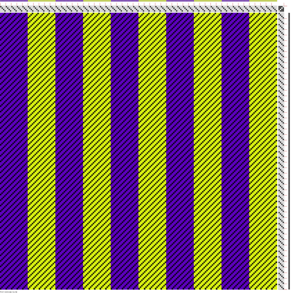
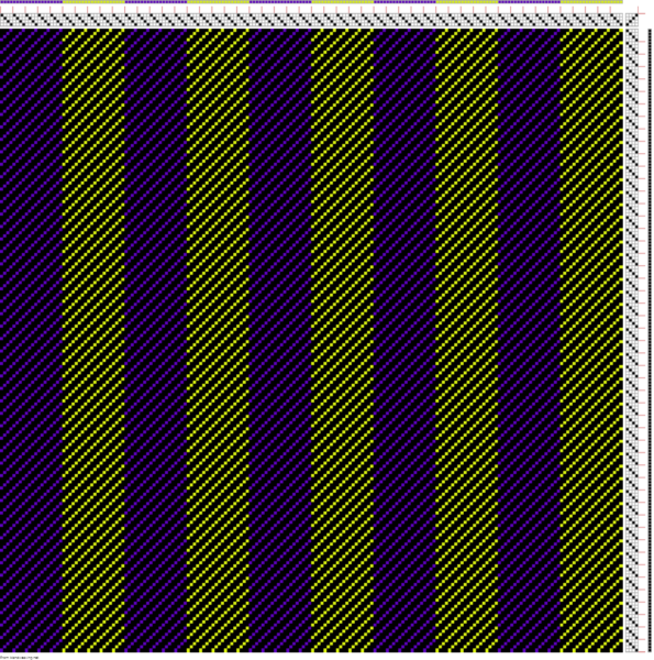
Because lime green is an assertive color, if you pair it with a color that contrasts strongly, it will pop out like a sore thumb. If you pair it with bright purple, which is nearly opposite on the color wheel and also much darker, you’ll get very strong hue and value contrast. (“Value” is the colorist’s term for the darkness of a color.) Result: the lime green becomes super-obvious.
If you place the lime green next to a color that is closer to it on the color wheel – for example, a dark green – then you get value contrast without hue contrast, and the lime green doesn’t stick out as strongly:
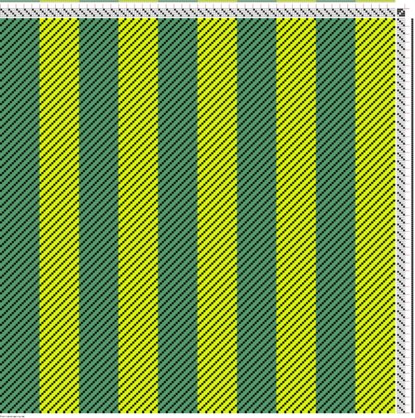
The lime green still sticks out, though.
The reason is intriguing: Your brain sees contrast much better in black and white than it does in color. That’s because you actually have two visual processing systems in your brain – one that evolved with the mammals, that sees only in black and white, and one that evolved with the primates, that handles color vision. The part that handles pattern recognition – that sees the boundaries between colors – operates in black and white.
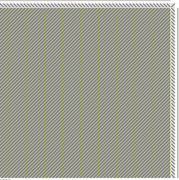
What that means is that to get the lime green to blend in, you need to pair it with a color of almost equal darkness.
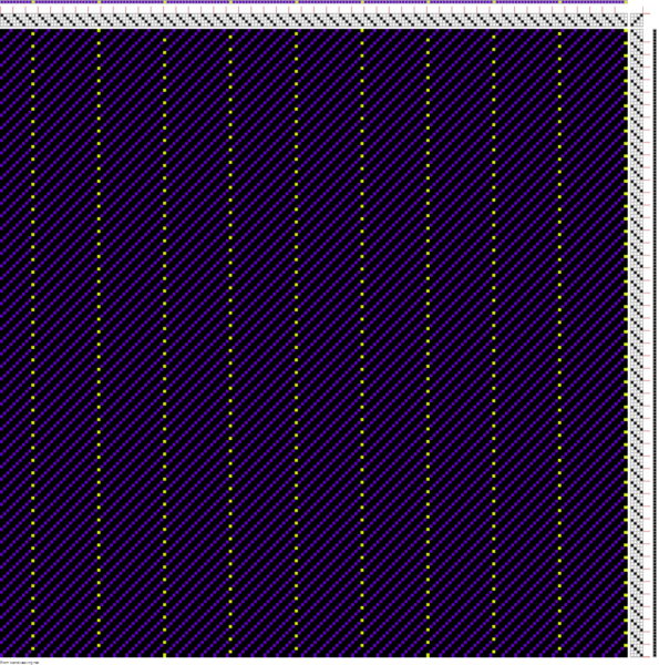
Here’s the lime green with a gray of about equal darkness:
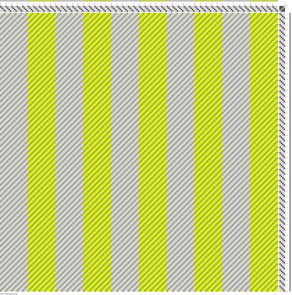
Now the lime green, while still bright, is much less obvious than with the purple background.
But suppose that the lime green is still not inconspicuous enough? Then it’s time to add in Strategy #2.
Strategy #2 for weaving with a color you don’t like: Reduce the amount that shows.
There are several strategies for reducing how much of a color shows in a fabric.
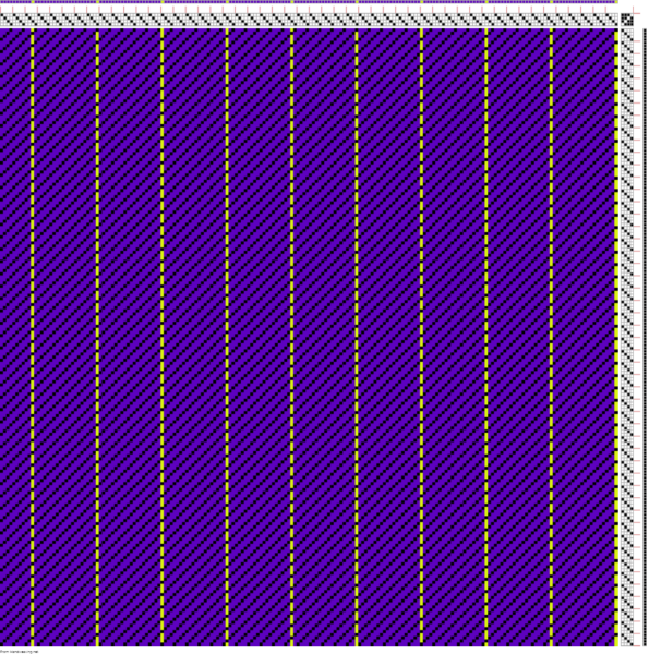
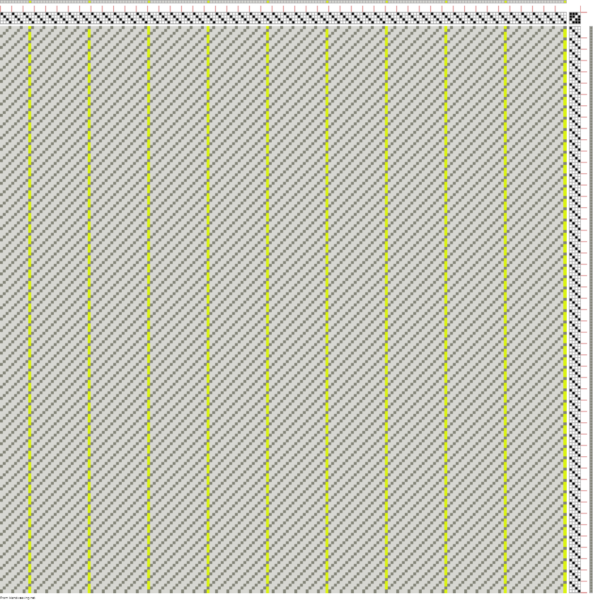
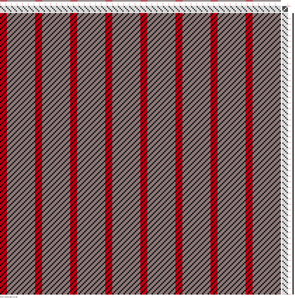
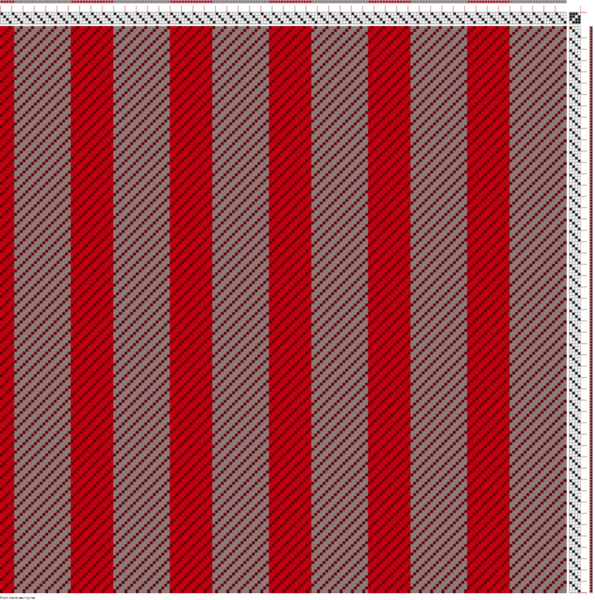
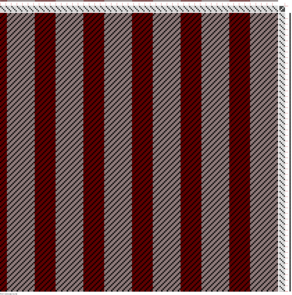
One method is simply to use less of it. A color that appears overwhelming in large quantities will appear much less overwhelming in smaller amounts. For example, the lime green in the lime green-and-purple first swatch may appear to be “too much”, but when reduced to pinstripes, it appears much less conspicuous:
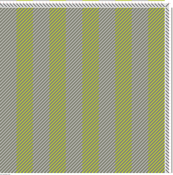
Another approach, if only one side of the fabric will show, is to use a draft that is warp-dominant on one side and weft-dominant on the other.
The drafts above are 3/1 twill, which shows 75% warp and 25% weft on the front side. On the reverse side, it shows 25% warp and 75% weft, so the lime green in the warp becomes much less obvious, even though it makes up exactly the same percentage of the cloth:
If you are making a lined jacket or bag, or some other creation where only one side of the cloth shows, this can be an excellent way to make an overly-bright color that you dislike less conspicuous.
If you combine these approaches with using lower-contrast colors, you can make the overly-bright color harmonize better with its environment, which may look more visually appealing to you – and if not, will make it almost disappear. Here is the lime green with the lower-contrast gray warp and dark gray weft, showing some of the possible combinations of approach #2:
What if the color you don’t like isn’t a screamingly bright color, but the reverse, a hue that you find dull and boring?
In that case, you can use any of the strategies outlined so far, but you can also use a third approach.
Strategy #3 for weaving with a color you don’t like: Partner it with a more eye-catching color.
Let’s suppose that your tastes run to more brilliant (saturated) colors. In that case, you might enjoy colors like cherry red or sapphire blue, but this softer, more subtle shade might not appeal to you:

What to do?
In this case, you actually want to pep up the piece by partnering your low-key color with a more eye-catching one, because your objection to the more subtle color comes from its lack of “personality”. So adding a more eye-catching color will do two things: add “zing” to the piece, and give the eye something else to focus on, so the lower-key color quietly fades into the background. It becomes attractive as a supporting color for its more dominant partner, rather than the dominant color in the piece.
Here’s an example. Suppose you find this cloth too low-key for your tastes (some people will like it, some won’t, but for the sake of argument, let’s just suppose you don’t!).

If so, then adding just a little bit of brilliant red will give the eye something else to look at, allowing the more understated color to act as an attractive background for the more dominant red.
Of course, if you want something more brilliant, you can change the amount of the more dominant partner:
And you need not use a full-on brilliant red, either. Here is a version with a more sedate maroon. Here the increase in value contrast (light/dark contrast) makes the piece interesting even though the partner color itself is not quite as saturated.
I hope this article has offered you a fresh way to look at your “ugly” colors, and that you are now eyeing some dusty, unused cones in a whole new light!
Happy weaving,

If you want to know more about how to create crisp, clear designs in your handwoven cloth, subscribe to my newsletter and get my FREE e-book! It will help you design beautiful handwoven fabrics, with a pattern as bold or subtle as you want.

Thank you for the tips. I have skeins of satisfying and unsatisfying colors from experimenting with natural dyes and would like to weave them into something ALL satisfying! These ideas will be very helpful!
Woo hoo! Hope it helps you with your dye experiments!
Wonderful, helpful post. .
It’s as if you read my mind, I was just looking at some screaming orange yarn in my stash wondering what I could do with it.
Thank you so much.
Glad you found it helpful!
Thank you so much for the idea solutions!!!!!
You’re welcome, Marcia! 🙂
I look forward to the academy! Appreciate all of the information in the blogs, etc., but your bright, beautiful personality pulls me back every time!