Have you ever struggled with a color so bright, it took over your entire piece?
Some colors are hard to use in handwoven cloth, because they blaze out so strongly that they dominate the piece. Yellows, oranges, and hot pink are the most assertive hues, but if you pair equal amounts of any bright color with a much duller color, the bright color will hog all the attention.
The key to balancing those domineering colors is to use them sparingly, and add more of the other shades in your palette. In other words, change the proportions of color in the piece.
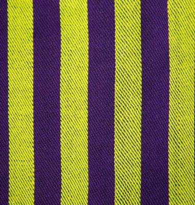
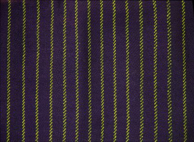
To see how this works, look at the sample below. It’s woven using purple and lime green warp and a black weft (3-1 twill structure). The lime green screams out from the cloth, drowning out the purple.
What’s going on?
Lime green is a very assertive color, while dark purple tends to recede from view. This is because the eye is attracted to light colors, bright colors, and warm colors. Lime green is light, bright, and very warm, while deep purple is dark, relatively dull, and cool. So the lime green bars attract the eye much more strongly than the purple ones, giving the impression that the cloth is mostly lime green. (It actually contains equal amounts of green and purple.)
Let’s change the amount of lime green. This handwoven cloth has four times as much purple as lime green:
Now the sample looks more balanced, but the lime green is still more prominent.
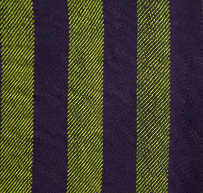
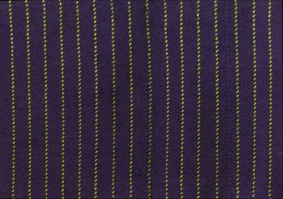
Let’s change the proportions again. This handwoven cloth is woven with twice as much purple as the previous sample – eight times as much purple as lime green.
Now the purple comes forward, and the lime green becomes a delightful accent rather than a domineering bully.
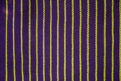
Another way to change the ratio between two colors is to choose a draft that shows less of the problematic color on the face of the fabric. Here are the same three samples, but woven in 1/3 twill. The top side of the fabric primarily shows the black weft, with only a little bit of the lime green and purple showing.
This looks much more balanced than the earlier sample with equal amounts of lime green and purple. That’s because the black weft blends visually with the lime green, dulling and darkening it so it doesn’t dominate as strongly.
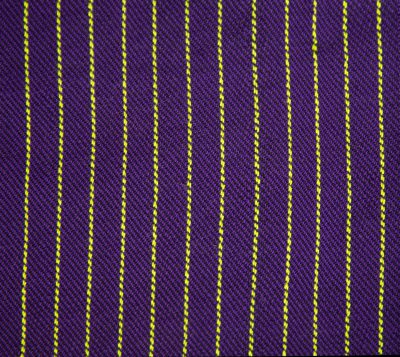
Let’s see what happens if we push the ratio a little further. Here’s a sample in 1-3 twill that is 80% purple, and 20% lime green. Now very little lime green is showing, and the cloth looks much duller. In fact, much of the excitement is lost as the amount of lime green diminishes. (Of course, that may be exactly what you want, if your intent is to create more conservative cloth.)
And here’s the final sample, an 8:1 ratio between purple and lime green. Because the black weft covers 3/4 of the purple and lime green warp, very little lime green is showing – and the resulting cloth is quite sedate compared to the earlier samples.
How much of each color do you need to get a visually balanced composition? It depends on what colors you are using. Johann Goethe, the 19th century writer, scientist, and statesman, proposed “light values” for each hue in his book Theory of Colors, with numbers representing the visual strength of each color. Calculating from the values in Goethe’s theory, the ideal proportions between colors for a balanced composition should be as follows:
| Hue | Proportion |
| yellow | 3 |
| orange | 4 |
| red | 6 |
| violet | 9 |
| blue | 8 |
| green | 6 |
To calculate the proportions of color needed, simply take the proportion of one hue and place it as a ratio with the other hue(s) in the composition. So if the composition were pure yellow and pure purple, Goethe’s suggested ratio would be 3:9, or three times as much purple as yellow. Or if the composition were orange, green, and violet, the ratio would be 4 parts orange, 6 parts green, and 9 parts violet. According to Goethe’s theory, this would produce a balanced composition.
That’s the theory. In practice, precise calculation doesn’t work well in handweaving, because Goethe was speculating only about a few “pure” hues – bright yellow, orange, red, violet, blue, and green. But most weavers have a much wider color palette than just six colors, and Goethe’s ratios don’t apply as well when using a more diverse palette. So while you can use the numbers to get a sense for which colors are stronger than others, you’ll still have to do some experimenting to figure out the right proportions of color for your piece. But it’s a starting point!
If you want to know more about how to create crisp, clear designs in your handwoven cloth, subscribe to my newsletter and get my FREE e-book! It will help you design beautiful handwoven fabrics, with a pattern as bold or subtle as you want. (If you’re already subscribed, just register again – you won’t get double the email, I promise!)
Happy weaving!
– Tien
Thanks, Tien
The need to think about the weave structure and how that plays into the full visual effect was an important point for me.
I’m loving your new warp and weave site. I find Goethe’s theory very helpful in planning colors in weaving. Thanks for reminding me of his work. You’re right in acknowledging that weave structure plays an important part. That’s why combining twills and plain weave in one piece can create such interesting effects as the eye sees spots of color in some areas and blocks of color in others. It’s so much fun!
Glad it was helpful for you!
Thank you for sharing!
You have unlocked a new world for me.