Ever picked out a brilliant palette of yarns, only to have your beautiful colors weave up into dull, muddy handwoven cloth?
You’re not alone. Picking a palette that will stay bright when mixed is one of the big color challenges in weaving. Fortunately, the solution is pretty straightforward: Choose hues that mix gracefully, or pick a weave structure that creates big blocks of color.
Fix #1: Choose compatible colors.
Some colors blend into each other beautifully, others create drab results. You can predict which colors produce bright blends and which colors produce dull ones by looking at where they fall on the color wheel.
This is the color wheel for physical media – paints, inks, and yarns:
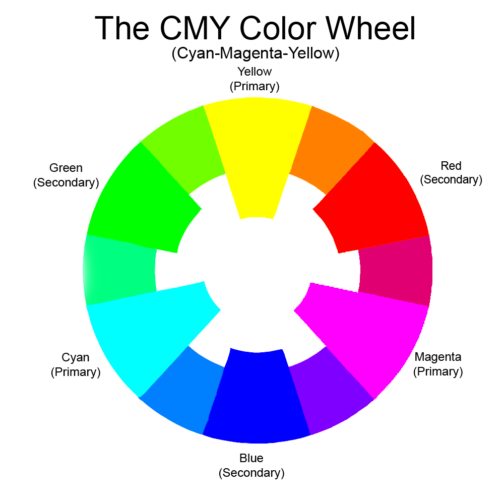
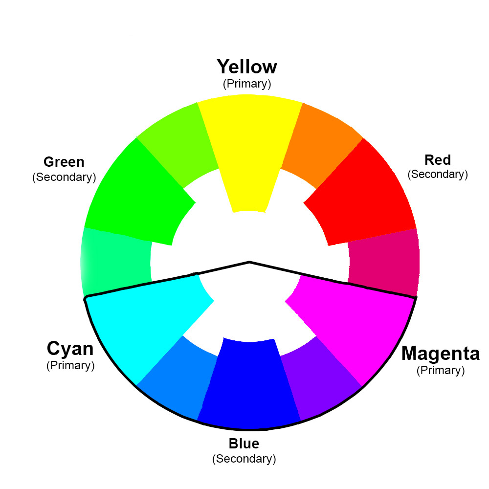
In general, colors that fall between two of the primary colors will mix into bright colors when woven. (The three primary colors are turquoise, magenta, and yellow, and are the largest triangles on the color wheel.) So mixing the colors between turquoise and magenta will result in vivid cloth:
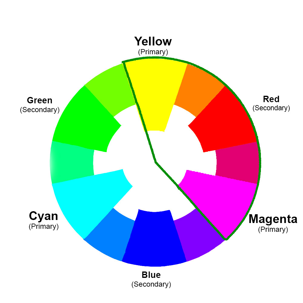
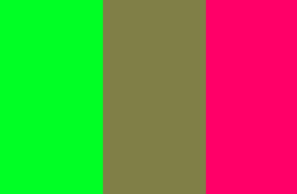
So will colors that fall between yellow and magenta:
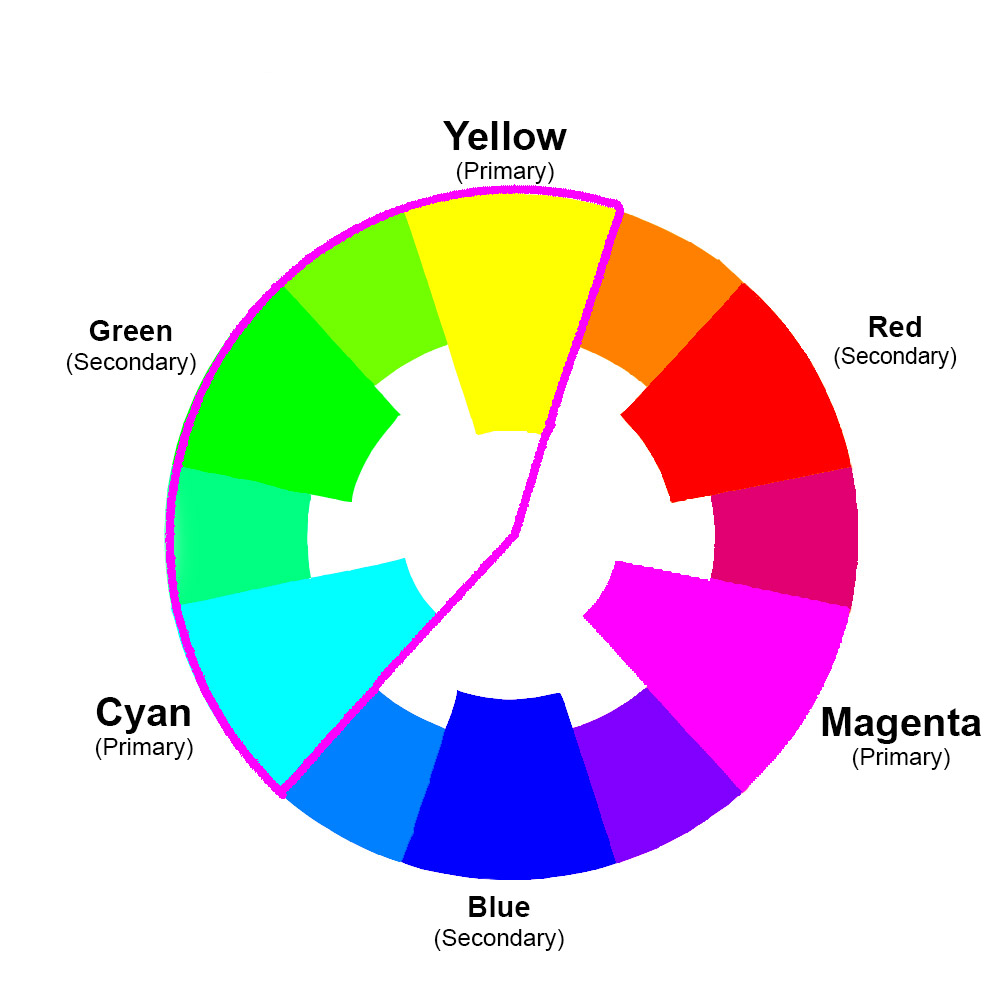
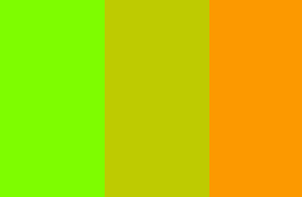
And colors that fall between yellow and turquoise:
Color combinations that fall into different segments (on opposite sides of a primary color) will mix into duller colors. The farther apart they are on the color wheel, the drabber the resulting color will be. Yellow green and orange, for example, are on opposite sides of yellow (a primary color), and will weave into pea-soup green:
This is not nearly as vivid as a mix of yellow and orange, which both fall into a single segment – between yellow and magenta.

As two colors get farther and farther apart on the color wheel, the shades produced by mixing those colors get duller and duller. So a mix of magenta and green, which are directly opposite each other on the color wheel, produces a very muted color when mixed.
How does this play out in weaving?
For plain weave, if you want the overall color to be bright, you’ll have to pick colors that fall in one of the segments outlined in the color wheel examples above – colors that fall between yellow and turquoise, magenta and turquoise, or yellow and magenta on the color wheel. Those colors will stay bright when mixed. (This is what I call the Two-Primary Rule: choose colors that fall between two primaries on the cyan-magenta-yellow color wheel.)
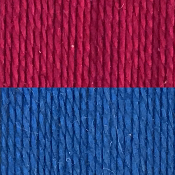
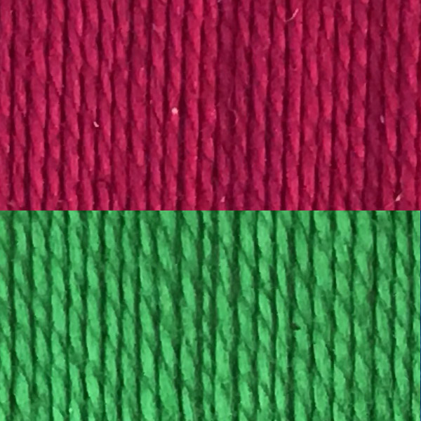
As an example, magenta and blue fall both fall into the magenta-to-turquoise segment of the color wheel. So they will blend into bright colors. When woven in plain weave, they produce a lively shade of purple, with specks of magenta and blue:
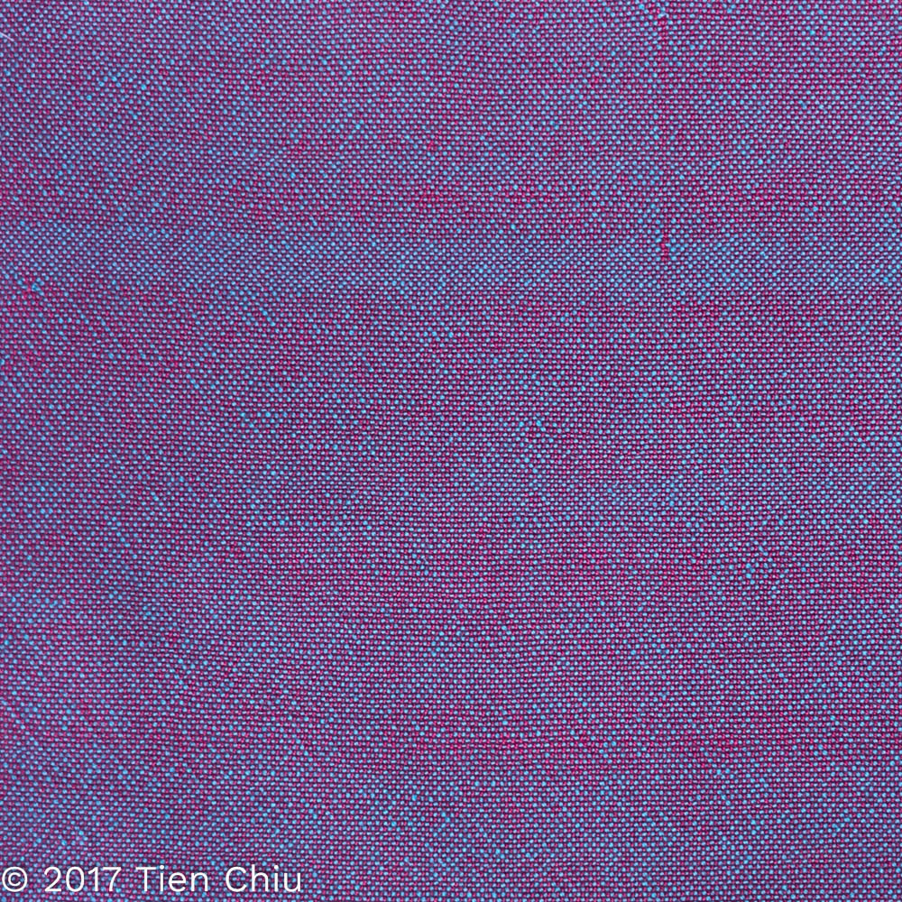
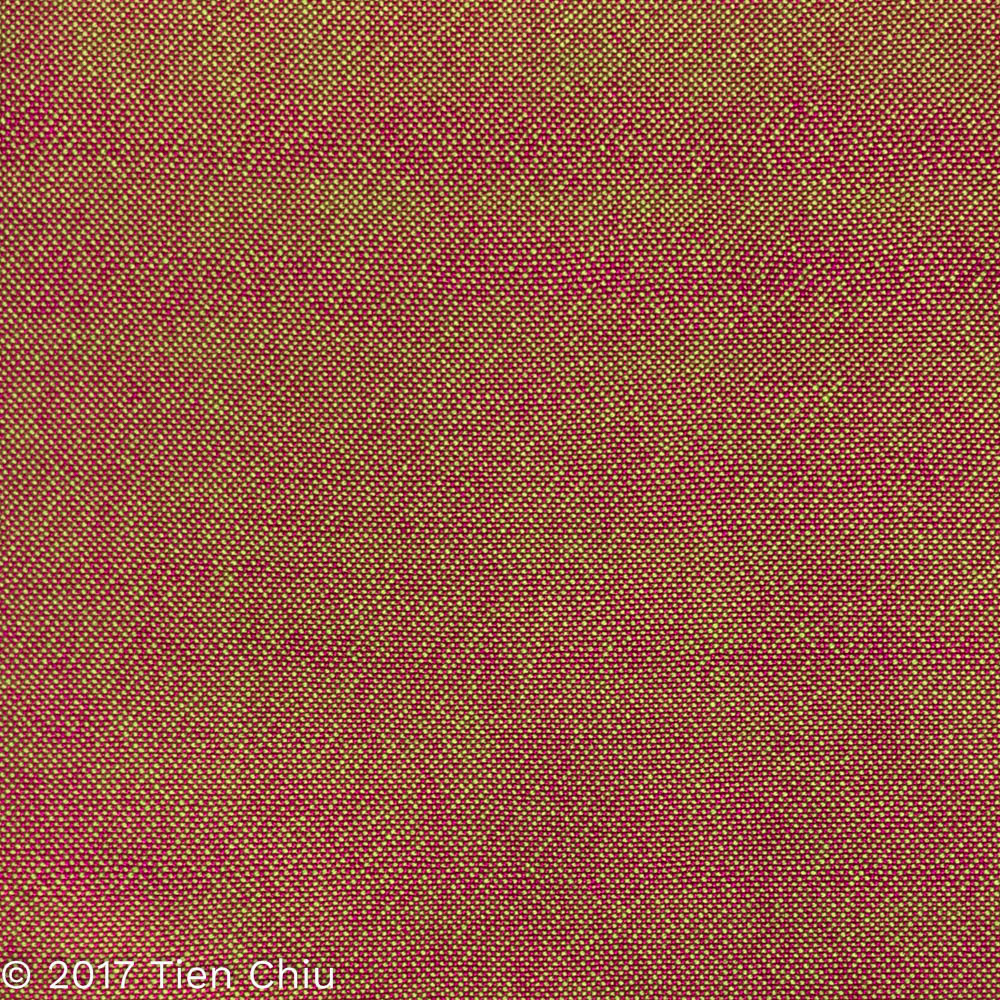
However, because magenta and green fall into different segments (and are opposites on the color wheel), these yarns blend into a much duller, brownish color when woven in plain weave:
So are you limited to closely related colors if you want bright colors in your handwoven cloth?
No! But to keep the colors bright, you will need to keep them from blending.
Fix #2: Use blocks of color.
Here are the green and magenta yarns again, but woven in 1/3 vs. 3/1 twill blocks this time.
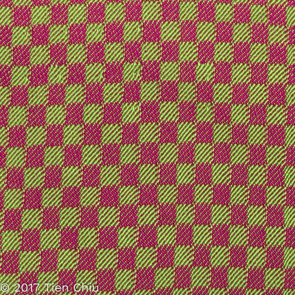
The blocks create large chunks of mostly-green and mostly-magenta, keeping the colors much brighter and creating a vivid design. (More details on how and why this works in my blog post about using black for pizzazz.)
So that’s the secret. If you want bright colors when two colors are mixed on a small scale (plain weave or short floats), choose compatible colors – colors that fall between two primary colors on the color wheel. But if you want to use a more diverse palette, use stripes and weave structures that keep the colors separate, giving large blocks of color.
If you want to know more about how to create crisp, clear designs in your handwoven cloth, subscribe to my newsletter and get my FREE e-book! It will help you design beautiful handwoven fabrics, with a pattern as bold or subtle as you want. (If you’re already subscribed, just register again – you won’t get double the email, I promise!)
Happy weaving!
– Tien
Well explained. Thanks Tien. Think I subscribed otherwise I don’t think I’d be getting these posts. My brain is still addled after the move, but I’m enjoying my life here in Silver City. Lots of wonderful, helpful weavers here. I don’t know if I’ll be up for your presentation to the Boulder guild as I’m having remodeling work done around that time…it all depends on the contractors.
These are excellent posts on color. They are helping me a lot. Thank you for posting them!
Excellent article – Thank you Tien Chiu!
I have no instinct, or eye, for working with colors. Your explaination of the reason and logic to color blending is very helpful. Thank you. Janet
Thanks, Tien! reposting this, for sure!
I’ve been mystified by color choices and the color wheel. This is the simplest explanation I’ve seen for using a color wheel and convinced me to sign up for your newsletter. Thank you.
Glad to have been of help!
Would the same be true of colors between the secondary colors?
Hi Kathy!
No, because any two secondary colors will fall in different segments, so you can easily wind up mixing colors that fall into different segments. If you look at the yellow-green and yellow-orange example, they both fall between green and orange (two secondary colors), but mix into a dull color.
Thank you! I’ve had a lot of dull weaving with colours that I thought I had chosen carefully. Now I understand my mistakes. I’m so glad I found you 🙂
Thank you for this. I’ve used colour but was always mystified by how it turned out. I used a red and blue for a baby blanket once and it turned out like your magenta and blue mix, which wasn’t my intent. I’ll pay more attention to colour selection and weave structure. I’m glad I found you.
Here's a question for you. Why do color wheels never deal with browns? We use them a lot, but they don't really show up anywhere. I know how to mix them but why are they so seldom dealt with?
Mostly because once you get into non-saturated colors it becomes really hard to represent all of them in a two-dimensional wheel. Brown is a less-saturated version of orange; you can kinda-sorta show it on a color wheel by extending it inward and outward (lightening and darkening the orange), but then there are rusty oranges, etc. The discussion of less-saturated colors is complicated and doesn’t really impinge on the discussion of color relationships, so it’s not included on the simplified color wheel. I do use it in more extended discussions of color mixing (e.g. in my classes).
Great article. Thank you
Graag zou ik van u de nieuwsbrief en ebook willen ontvangen
Ben erg geïnteresseerd in de manier en de kleuren van het weven
Alvast hartelijk dank
En ga aub door met deze prachtige projecten ????
Gr Ieta
Thanks for the info!
Love your posts. Starting to get the feel of color. Not yet there but coming along. Loved idea of black and white photo.
Hi I am creating a tapestry with cobalt blue and orange as well as white, black and lighter shades of blue and orange. The colors are real colors on the loggerhead turtle. I would like to keep the colors real but don't want them to be mud. The sections are really large and not always near one another- the blue and the orange. I never heard about colors between two primaries being best- I thought orange and cobalt blue were complementary and good together.
Hi there! As long as the colors are not *mixing*, you should be just fine. It’s only if the colors are mixing together or blended in small dots of color that you need to worry about getting muddy results!