Have you ever had a handwoven project turn out looking blah and boring – but you didn’t know how to fix it?
Read this article, and you’ll never have a ho-hum piece again.
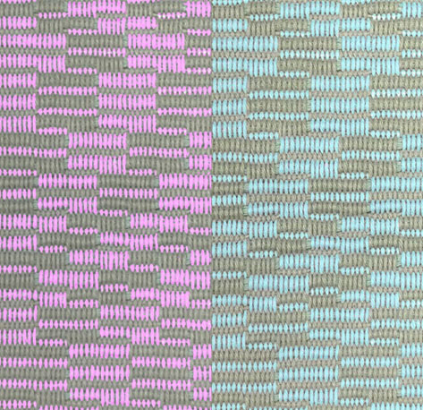
I received a photo of a wonderfully illustrative sample a few days ago from weaving teacher and weaving shop owner Mary Berry (check out her website here). Mary was experimenting with repp weave. Here’s the sample:
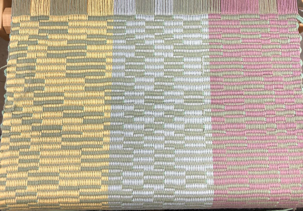
The pink and gray-green sample feels pretty boring. The blue-green sample is more interesting, but still ho-hum. The yellow and green sample, on the other hand, is full of liveliness.
What’s going on?
It’s all about contrast. The left side has it, the right side doesn’t.
Think of a handwoven piece as a cocktail-party conversation between colors. A conversation between very similar colors will be a calm discussion, with not much controversy. It will be a comfortable discussion – and those can be wonderful! – but won’t set off firecrackers. Your piece might feel calm and meditative to some people – but dull and blah to others.
A conversation between very different colors, on the other hand, might be like an argument between two people on opposite sides of the philosophical spectrum. Let the fireworks fly! Colors that are very different in hue, value, or saturation will naturally create contrast, making a piece more exciting. And that’s exactly what’s happening in this sample!
Let’s start by looking at the sample in black and white. Value contrast (light/dark contrast) is the most important aspect of a design. That’s because the part of our brain that sees pattern and perceives depth doesn’t see color at all! It’s a primitive part of our visual system that evolved millions of years ago, before our mammalian ancestors had color vision.
Here’s what the sample looks like in black and white:
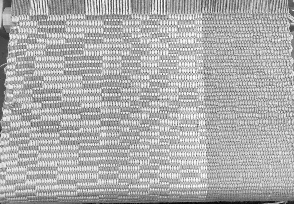
No wonder the pink and green sample on the right looks so boring! The pink and green are exactly the same darkness, so the pattern-perceiving part of your brain – which operates only in black and white – thinks the design is solid gray. As a result, the pattern is perceived as very subtle, and that section of the sample looks boring.
Now, the blue-green part of the sample has very similar light/dark contrast to the yellow-green part. Yet it is not nearly as lively:
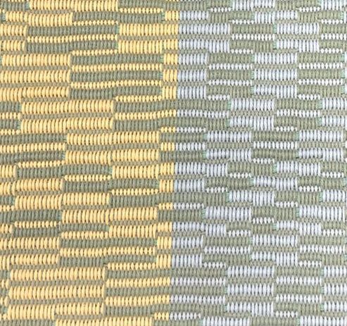
This is because of a different kind of contrast: Saturation. The yellow yarn is much more saturated (brighter) than the blue yarn, so it contrasts more strongly with the green yarn.
I changed the swatch in Photoshop to make the blue yarn as saturated as the yellow yarn. You can see that the blue yarn now stands out just as well as the yellow yarn:

There is a third kind of contrast – hue contrast. The hue of a color is its color family – like red, green, blue, or purple – and hue contrast depends on where a color’s native hue sits on the color wheel.
Here’s a color wheel, which shows how the basic hues relate to each other:
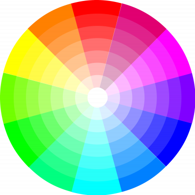
The further apart two colors are around the rim of the color wheel, the stronger the hue contrast will be.
Here are two versions of the blue sample – one with turquoise and one with pink yarn against the dull green.
Turquoise and green sit near each other on the color wheel, but pink and green sit nearly opposite each other on the color wheel. So it’s no surprise that the pink and green combination is more dramatic than the blue and green combination. (The effect would be even stronger if the green were more saturated, i.e. brighter.)
So if you have ever felt a piece came out too boring but weren’t sure how to fix it, now you know! Colors are like people – they have far more dramatic conversations when they have contrasting viewpoints and philosophies.
Summing up: If you want more drama in your cloth, add contrast to your colors. Start by adding value (light/dark) contrast. Then, look at hue and saturation contrast.
Of course, if your cloth is too dramatic, you can tone it down by doing the reverse: Reduce the contrast in value, hue, or saturation.
Happy weaving!

If you want to know more about how to create crisp, clear designs in your handwoven cloth, subscribe to my newsletter and get my FREE e-book! It will help you design beautiful handwoven fabrics, with a pattern as bold or subtle as you want.
Brilliant, a cocktail party conversation!